There's an old saying on Wall Street: copper has a PhD in economics. The idea is simple — copper is everywhere. It's in the wires that carry electricity, the pipes that move water, the circuits inside every device. When the global economy accelerates, demand for copper rises. When it contracts, demand falls. Unlike stocks, copper doesn't run on sentiment or narratives. It runs on actual industrial activity. It's one of the few assets that tells you what's really happening, not what people think is happening.
That observation started as a passing curiosity. I wanted to know: if copper really does track the global business cycle, can I use it to classify the state of the market — and does that classification actually predict equity returns?
Motivation
I had this idea in high school — staring at a spreadsheet I'd put together myself. Copper prices, S&P 500, US CPI, PMI, Russia SPI. I had no statistical training, no idea what a model was. All I could do was plot the lines and compare them.
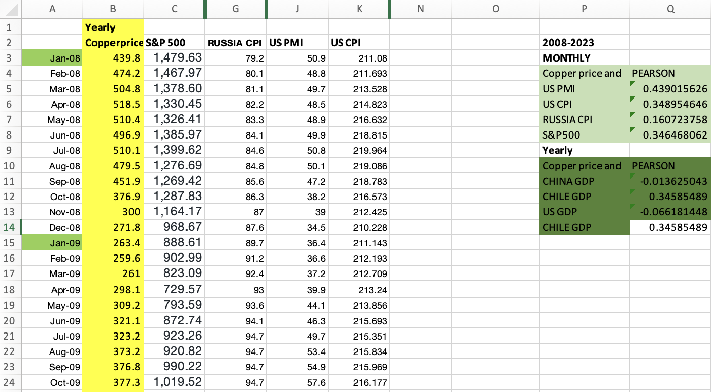
Actual Excel sheet I used in high school
I noticed copper seemed to move before the others. I didn't know what to do with that observation. I just wrote it down and moved on.
Years later, studying Data Science at NYU, I came back to the same question. This time, I wanted more than a chart. If copper really does track the global business cycle, can I define that relationship precisely — classify market states, validate them statistically, and use them to forecast equity returns?
The Idea
The first version of the model was almost embarrassingly simple. Take copper prices, compute a rolling z-score, and use that to decide whether the market is in a good or bad state. The logic was straightforward: when copper is trending above its historical average, global demand is strong, risk appetite is elevated — risk-on. When it's trending below, the opposite — risk-off.
But a single signal felt fragile. Copper alone could be distorted by supply shocks, geopolitical disruptions, or speculative positioning. If the thesis was really about the macro environment, I needed more signals that captured the same underlying dynamic from different angles.
I landed on four additions: copper/gold ratio (gold rises in fear, copper rises in growth — their ratio is a clean risk appetite proxy), DXY (stronger dollar tightens global financial conditions and typically signals risk-off), US 10-year Treasury yield (rising yields in a growth environment signal risk-on), and WTI crude oil (like copper, oil demand reflects real economic activity).
Five signals. Each telling part of the same story.
Building the Model
The first engineering decision was how to make five signals with completely different scales and units comparable. The answer was z-scores — for each signal, I computed a 3-month smoothed rolling mean and standard deviation, then normalized each observation relative to its recent history. This way, a reading of +1.5 means the same thing whether it's copper prices or Treasury yields: the signal is 1.5 standard deviations above its recent average.
Each z-score was then weighted and summed into a single composite risk score:
- Copper: 35%
- Copper/Gold ratio: 25%
- WTI Crude: 15%
- DXY: −15% (inverted — a stronger dollar is risk-off)
- US 10Y Yield: −10% (inverted in this context)
The composite score was smoothed with a 2-month moving average to reduce noise. Finally, I classified each month into one of three regimes using the 33rd and 67th percentile thresholds: Risk-ON, Neutral, or Risk-OFF.
The choice of three states rather than two was deliberate. Markets spend a lot of time in ambiguous, transitional conditions. Forcing a binary classification would paper over that ambiguity. A neutral regime that says "we don't have a strong signal right now" is itself useful information.
What the Data Said
The results across 190 monthly observations (2006–2026) were cleaner than I expected.
| Regime | Avg Next-Month S&P 500 Return | Hit Rate |
|---|---|---|
| Risk-ON | +1.72% | 68.9% |
| Neutral | +1.04% | 66.1% |
| Risk-OFF | +0.37% | 59.7% |
The spread between Risk-ON and Risk-OFF was +1.35% per month — consistent directional ordering across the full sample. In Risk-ON regimes, the market was up the following month nearly 7 out of 10 times.
That's not a trading strategy. A 1.35% monthly spread doesn't account for transaction costs, execution, or the many ways a simple backtest can mislead you. But it was a clear enough signal to ask the next question.
The Problem with V1
V1 had a fundamental flaw: look-ahead bias.
When I computed the z-score thresholds — the 33rd and 67th percentiles used to classify regimes — I used the entire dataset. That means the model, in classifying any given month in 2009, had access to data from 2020 and 2024. In reality, no one in 2009 knew what the distribution of copper prices would look like fifteen years later.
This is one of the most common mistakes in quantitative research. The model looked good on paper partly because it was, in a subtle way, cheating. V1 was a proof of concept. V2 had to be an honest test.
V2: Testing What the Model Actually Knows
Walk-forward validation is the standard solution to look-ahead bias. The idea is simple: only use data that would have been available at the time of each prediction.
I designed the validation as follows: train on 60 months, predict the next 12, then roll forward by 12 months and repeat. In each fold, the z-score parameters and percentile thresholds were estimated exclusively on the training window — the test period saw none of that data. Ten folds, 110 out-of-sample observations spanning 2012–2023.
The results held up.
| Model | Market | Spread (ON−OFF) | Risk-ON Return | Risk-ON Hit Rate |
|---|---|---|---|---|
| V1 | S&P 500 (in-sample) | +1.35% | +1.72% | 67.7% |
| V2 | S&P 500 (OOS) | +1.34% | +2.22% | 77.8% |
| V2 | KOSPI (OOS) | +2.01% | +2.14% | 74.1% |
The OOS spread on the S&P 500 was virtually identical to the in-sample result — +1.34% vs +1.35%. More surprisingly, extending the model to KOSPI without any retraining produced an even larger spread of +2.01%. The signal, built entirely around US and global macro data, showed meaningful portability to the Korean equity market.
A bootstrap significance test (10,000 permutations) confirmed the spreads were unlikely to be random noise — though neither market cleared the 5% significance threshold, which is worth being honest about. The sample size is limited, and the signal is not a silver bullet.
What I Took Away
The model works well enough to be interesting, and honest enough about its limits to be useful.
The most important thing I learned wasn't about copper or macro regimes. It was about the discipline of building a model the right way — separating what the model actually knows from what it was told in hindsight, testing it on data it's never seen, and documenting every step including the parts where it fails.
Doctor Copper V2 is not a finished product. The per-fold spread analysis showed that results varied significantly across time periods — the signal worked well in some regimes and broke down in others. That inconsistency is the next question worth asking.
And that, in the end, is the whole point.
Data: Yahoo Finance via yfinance · Full code and notebook: github.com/junshin0922/doctor-copper-v2